ggplot(data_plot, mapping = aes(x = col_A, y = col_B)) +
geom_boxplot(outlier.color = "red")Visualize distributions with boxplots
You want to compare the distributions of several groups with a set of boxplots. A boxplot is a concise way to show the first, median, and third quartiles of a group of points, along with the spread of the distribution and any outliers.
Step 1 - Pass your data to ggplot2::ggplot(). ggplot() creates a blank canvas for your plot.
Step 2 - Map a continuous variable to one axis.
Step 3 - …and a categorical variable to the other. Map the categorical variable to the \(x\) axis for vertical boxplots or to the \(y\) axis for horizontal boxplots.
Step 4 - Add a layer of boxplots with ggplot2::geom_boxplot(). ggplot() will draw a boxplot for each category.
Step 5 (Optional) - Change the appearance of your boxplots. Within geom_boxplot(), set the outlier.color, outlier.shape, fill, or outline color of each boxplot.
Example
uberx contains hourly summaries of UberX rideshare services in regions of Boston, Massachusetts.
uberx# A tibble: 144 × 5
region hour price_mean distance_mean api_calls
<chr> <int> <dbl> <dbl> <int>
1 Back Bay 0 10.9 2.53 9
2 Beacon Hill 0 10.3 2.16 15
3 Boston University 0 10.2 2.71 12
4 Fenway 0 10.6 2.85 17
5 Financial District 0 9.75 2.35 10
6 Theatre District 0 9.7 2.01 5
7 Back Bay 1 10.3 2.08 12
8 Beacon Hill 1 9.46 1.86 12
9 Boston University 1 10.8 3.18 15
10 Fenway 1 10 2.72 11
# ℹ 134 more rowsWe want to know if the UberX prices differ across regions of Boston. To explore this relationship, we visualize the distribution of price_mean for each category of region with boxplots.
To begin, we load the ggplot2 package. Next, we create a plot with region on the x-axis, price_mean on the y-axis, and color the outlier points red.
library(ggplot2)
ggplot(uberx, mapping = aes(x = region, y = price_mean)) +
  geom_boxplot(outlier.color = "red")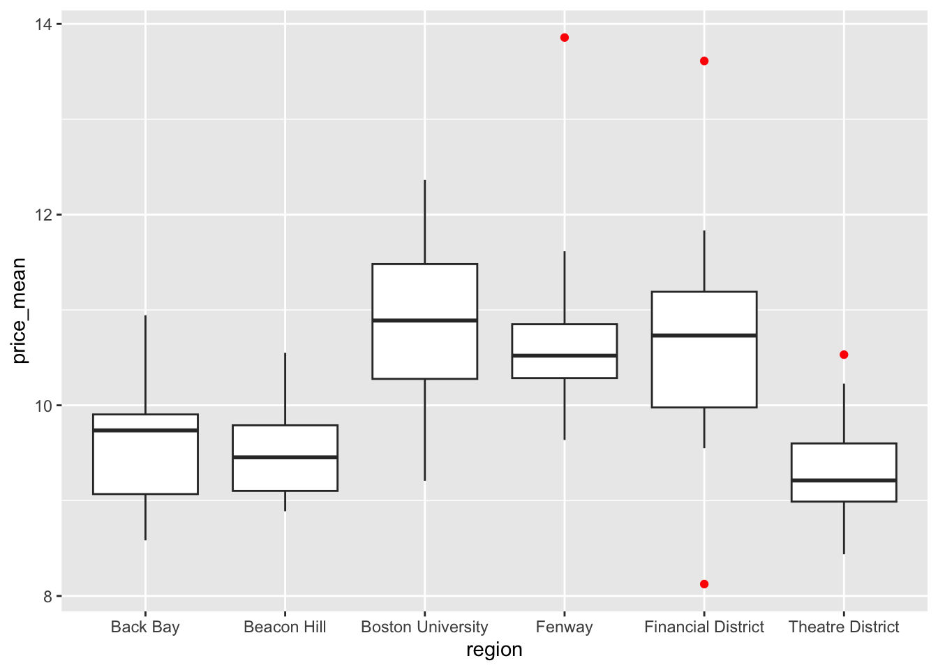
Order box plots by group median
You can make the trend in your boxplots easier to see if you reorder the levels of your categorical variable by their median values of the continuous variable, with forcats::fct_reorder().
ggplot(uberx,
  mapping = aes(
    x = fct_reorder(region, price_mean, .fun = median),
    y = price_mean
  )
) +
  geom_boxplot()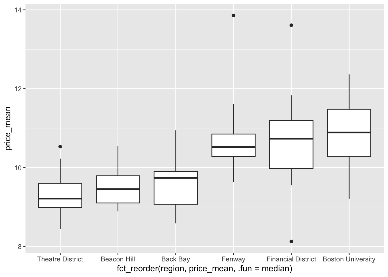
Box plots in SAS
ggplot() with geom_boxplot() is the equivalent of SAS’s SGPLOT procedure with the VBOX statement:
In SAS:
PROC SGPLOT DATA = data_plot;
  VBOX col_B / CATEGORY col_A;
RUN;
In R:
ggplot(data_plot, mapping = aes(x = col_A, y = col_B)) +
  geom_boxplot()