ggplot(data_plot, mapping = aes(x = col_A)) +
geom_bar(mapping = aes(fill = col_B))Visualize grouped counts with a stacked bar chart
You want to visualize the counts of one categorical variable grouped by values of another categorial variable. In other words, you want to make a bar chart whose bars are each subdivided into different colors according to a second variable.
Step 1 - Pass your data to ggplot2::ggplot(). ggplot() creates a blank canvas for your plot.
Step 2 - Map the main categorical variable to the \(x\) axis with mapping = aes(x = ). ggplot() will compute counts from the data and map those to the \(y\) axis.
Step 3 - Add a layer of bars with ggplot2::geom_bar(). geom_bar() will draw a bar for each distinct value of the main categorical column and map the height of the bar to the number of observations in that category.
Step 4 - Set fill to the grouping categorical variable in geom_bar(mapping = aes(fill = )) to color each bar by the categories of the grouping variable.
Example
sleep describes the sleep habits of surveyed individuals. The column snore_ is survey responses to “In the past 12 months, how often did you snore while sleeping?”.
sleep # A tibble: 6,161 × 5
seq_no sex sleep_workday sleep_wknd snore_
<dbl> <chr> <dbl> <dbl> <fct>
1 93705 female 8 8 Occasionally
2 93706 male 10.5 11.5 Rarely
3 93708 female 8 8 Don't know
4 93709 female 7 6.5 Rarely
5 93711 female 7 9 Occasionally
6 93712 male 7.5 9 Rarely
7 93713 male 5.5 7 Never
8 93714 male 7 8 Frequently
9 93715 male 5 5 Frequently
10 93716 male 7 9 Frequently
# ℹ 6,151 more rowsWe want to know how common snoring is in men compared to women among the survey respondents. To study this, we use a bar chart visualize the number of respondents that selected each of the answers to, “In the past 12 months, how often did you snore while sleeping?” and fill in the color of each bar by sex.
library(ggplot2)
ggplot(sleep, mapping = aes(x = snore_)) +
  geom_bar(mapping = aes(fill = sex))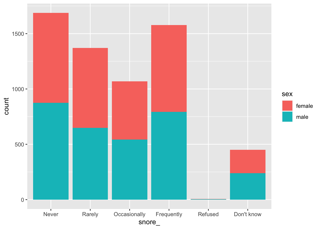
Side-by-side grouped bar chart
Set position to “dodge” in geom_bar() to create side-by-side bars, rather than stacked bars.
ggplot(sleep, mapping = aes(x = snore_)) +
  geom_bar(mapping = aes(fill = sex), position = "dodge")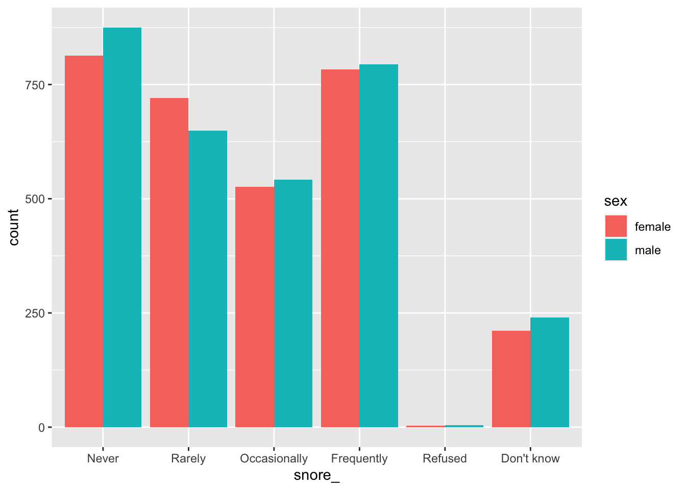
Grouped bar charts in SAS
ggplot() with geom_bar() filled by a second categorical variable is the equivalent of SAS’s SGPLOT procedure with the VBAR statement and GROUP option. The position = "dodge" argument in geom_bar() is the equivalent of GROUPDISPLAY = CLUSTER in SAS. The default for either program is stacked bars.
In SAS:
PROC SGPLOT DATA = data_plot;
  VBAR col_A / GROUP col_B GROUPDISPLAY = CLUSTER;
RUN;
In R:
ggplot(data_plot, mapping = aes(col_A)) +
  geom_bar(mapping = aes(fill = col_B), position = "dodge")