ggplot(data, mapping = aes(x = col_A, y = col_B)) +
geom_line() Visualize ordered continuous data with a line chart
You want to visualize the relationship between two continuous variables with a line chart. Usually, one of your variables is monotonically increasing, like a date or a time.
Step 1 - Pass your data to ggplot2::ggplot(). ggplot() creates a blank canvas for your plot.
Step 2 - Map variables to the the \(x\) and \(y\) axes with mapping = aes(x = , y = ). If one of your variables is a date or time, place it on the \(x\) axis.
Step 3 - Add a layer of lines with ggplot2::geom_line(). geom_line() will draw a single line connecting all data points from left to right along the x-axis.
Step 4 (Optional) - Use mapping = aes() to define groups. If you map a grouping variable to group, color, linetype, size or alpha, geom_line() will draw a separate line for each value of the grouping variable.
Add data point markers
Add a second layer of points to identify the data points along the line, e.g.
ggplot(data, mapping = aes(x = col_A, y = col_B)) +
  geom_line() +
  geom_point()
Example
uber_fenway contains hourly summaries of Uber rideshare services for one day in the Fenway neighborhood of Boston, Massachusetts.
uber_fenway# A tibble: 72 × 3
hour price_mean service
<int> <dbl> <chr>
1 0 9.95 UberPool
2 0 10.6 UberX
3 0 18.1 UberXL
4 1 9.08 UberPool
5 1 10 UberX
6 1 17.8 UberXL
7 2 8.82 UberPool
8 2 10.4 UberX
9 2 16.8 UberXL
10 3 9.56 UberPool
# ℹ 62 more rowsWe want to know how the price of Uber rides changes throughout the day in Fenway.
To explore this, we visualize the relationship between price_mean and hour as a line chart. We use color to create a separate line for each type of Uber service.
library(ggplot2)
ggplot(
  uber_fenway,
  mapping = aes(x = hour, y = price_mean, color = service)
 ) +
  geom_line()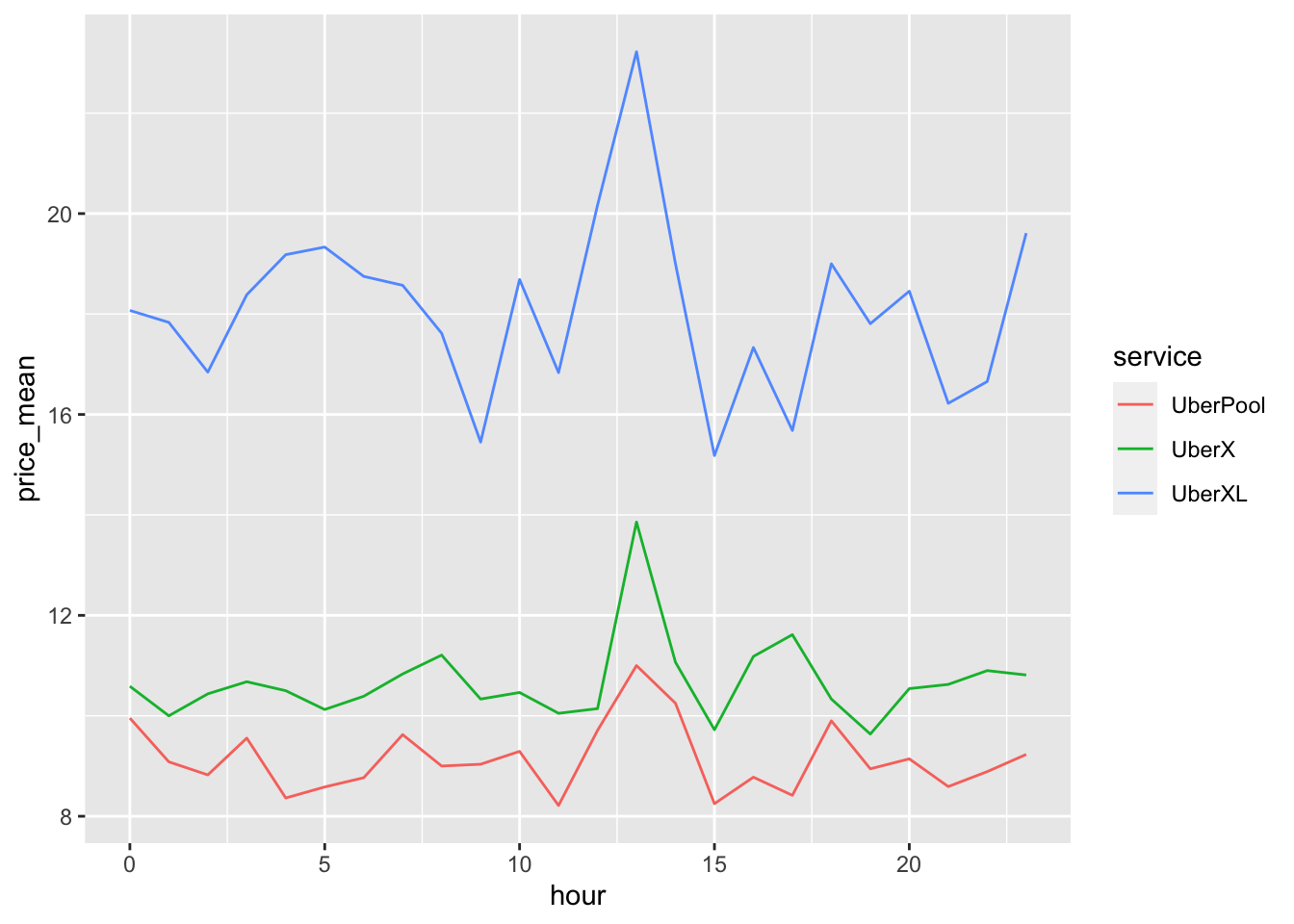
Respect groups
If your line chart suffers from a whipsaw effect, as below, it is likely that you are trying to plot multiple groups with a single line. Map a grouping variable to color or group to restore order.
ggplot(uber_fenway, mapping = aes(x = hour, y = price_mean)) +
  geom_line()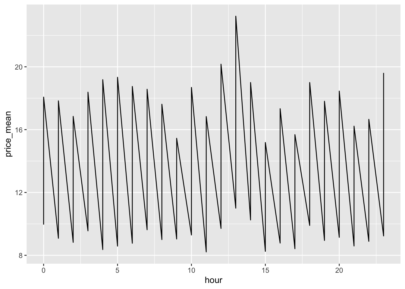
Line charts in SAS
ggplot() with geom_line() and geom_point() is the equivalent of SAS’s SGPLOT procedure with the SERIES statement:
In SAS:
PROC SGPLOT DATA = data_plot;
  VBAR X = col_A Y = col_B / MARKERS;
RUN;
In R:
ggplot(data_plot, mapping = aes(x = col_A, y = col_B)) +
  geom_line() +
  geom_point()