ggplot(data_plot, mapping = aes(x = col_A)) +
geom_bar(mapping = aes(fill = col_B))Visualize counts with a bar chart
You want to visualize the distribution of a categorical variable with a bar chart. The height of the bars in a bar chart are proportional to the number of cases in each group of the categorical variable.
Step 1 - Pass your data to ggplot2::ggplot(). ggplot() creates a blank canvas for your plot.
Step 2 - Map a categorical variable to the \(x\) axis with mapping = aes(x = ). Since we intend to make a bar chart do not map a variable to the \(y\) axis.
Step 3 - Add a layer of bars with ggplot2::geom_bar(). ggplot2 will draw a bar for each distinct category, and map the height of the bar to the number of observations in that category.
Step 4 (Optional) - Use mapping = aes() to add additional variables. Consider mapping these variables to color, fill, or alpha (transparency).
Horizontal bars
If you prefer a horizontal bar chart, map your categorical variable to the \(y\) axis.
ggplot(data_plot, mapping = aes(y = col_A)) +
  geom_bar(mapping = aes(fill = col_B))
Example
sleep describes the sleep habits of surveyed individuals.
sleep # A tibble: 6,161 × 4
seq_no sleep_workday sleep_wknd snore_
<dbl> <dbl> <dbl> <fct>
1 93705 8 8 Occasionally
2 93706 10.5 11.5 Rarely
3 93708 8 8 Don't know
4 93709 7 6.5 Rarely
5 93711 7 9 Occasionally
6 93712 7.5 9 Rarely
7 93713 5.5 7 Never
8 93714 7 8 Frequently
9 93715 5 5 Frequently
10 93716 7 9 Frequently
# ℹ 6,151 more rowsWe want to know how common snoring is among the respondents. To study this, we visualize the number of respondents that selected each of the answers to, “In the past 12 months, how often did you snore while sleeping?”
library(ggplot2)
ggplot(sleep, mapping = aes(x = snore_)) +
  geom_bar()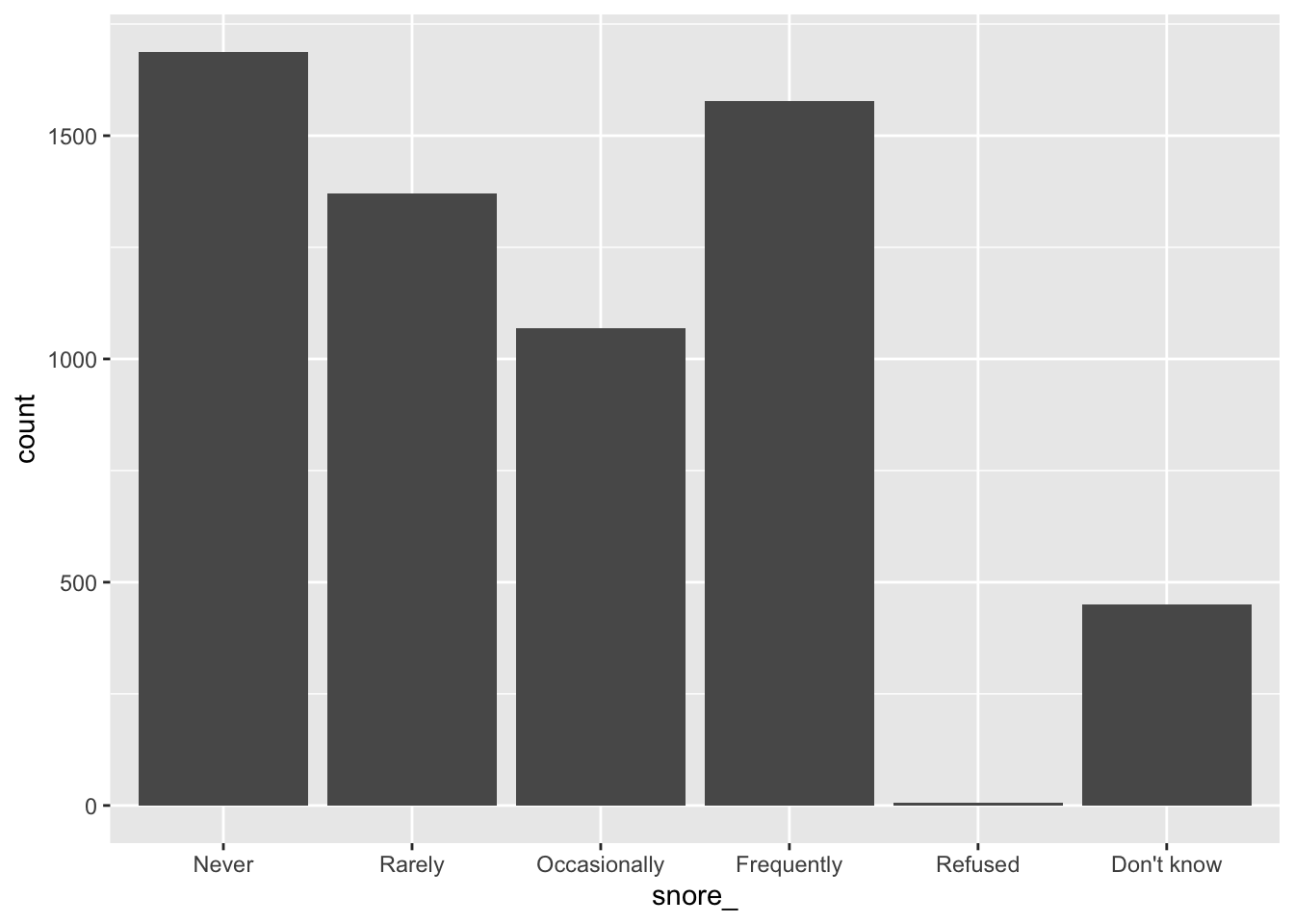
Map bar heights to values in the dataset
ggplot2::geom_col() is a version of geom_bar() that allows you to map bar heights to a variable from your dataset (instead of implicitly mapping bar heights to counts), e.g.
library(tidyverse)
tibble(
   categories = c("a", "b", "c"),
   heights = c(2.3, 1.9, 3.2)
) %>%
ggplot(df, aes(x = categories, y = heights)) +
  geom_col()
Bar charts in SAS
ggplot() with geom_bar() is the equivalent of SAS’s SGPLOT procedure with the VBAR statement:
In SAS:
PROC SGPLOT DATA = data_plot;
  VBAR col_A;
RUN;
In R:
ggplot(data_plot, mapping = aes(col_A)) +
  geom_bar()