ggplot(data, mapping = aes(x = col_B)) +
geom_histogram(binwidth = 10, color = "black")Visualize a distribution with a histogram
You want to visualize the distribution of a continuous variable with a histogram. A histogram divides the range of a variable into equal length intervals, known as bins. It then plots a bar above each bin to show how many observations fall within the bin.
Step 1 - Pass your data to ggplot2::ggplot(). ggplot() creates a blank canvas for your plot.
Step 2 - Map a continuous variable to the \(x\) axis with mapping = aes(x = ). Since we intend to make a histogram, do not map a variable to the \(y\) axis.
Step 3 - Add a layer of histogram bars with ggplot2::geom_histogram(). geom_histogram() will compute binned counts from the data and map those to the \(y\) axis. Set the binwidth or bins arguments to change the default number of bins (30).
Step 4 (Optional) - Change the appearance of your histogram. Within geom_histogram(), color the outline of each bin, fill the interior of each bin with a color, or use alpha to adjust the transparency of each bin.
Plot densities
geom_histogram() can plot densities on the y axis instead of counts. To plot densities, set the \(y\) aesthetic to the special variable name ..density... You won’t find ..density.. in your dataset; ggplot2 computes it when it generates the histogram.
ggplot(data, mapping = aes(x = col_B, y = ..density..)) +
  geom_histogram(binwidth = 10)
Example
sleep describes the sleep habits of surveyed individuals.
sleep # A tibble: 6,161 × 5
seq_no sleep_wkday sleep_wknd snore_ overly_sleepy
<dbl> <dbl> <dbl> <fct> <fct>
1 93705 8 8 Occasionally Never
2 93706 10.5 11.5 Rarely Rarely - 1 time a month
3 93708 8 8 Don't know Sometimes - 2-4 times a month
4 93709 7 6.5 Rarely Rarely - 1 time a month
5 93711 7 9 Occasionally Often- 5-15 times a month
6 93712 7.5 9 Rarely Sometimes - 2-4 times a month
7 93713 5.5 7 Never Sometimes - 2-4 times a month
8 93714 7 8 Frequently Often- 5-15 times a month
9 93715 5 5 Frequently Almost always - 16-30 times a mon…
10 93716 7 9 Frequently Often- 5-15 times a month
# ℹ 6,151 more rowsWe want to see how many hours respondents typically sleep on weekdays (sleep_wkday), and how much the amount of sleep varies among respondents.
To begin, we load the ggplot2 package. Next, we create a plot with sleep_wkday on the x-axis, specify the histogram bin width, and set the bin outline color to black.
library(ggplot2)
ggplot(sleep, mapping = aes(x = sleep_wkday)) +
  geom_histogram(binwidth = 1, color = "black")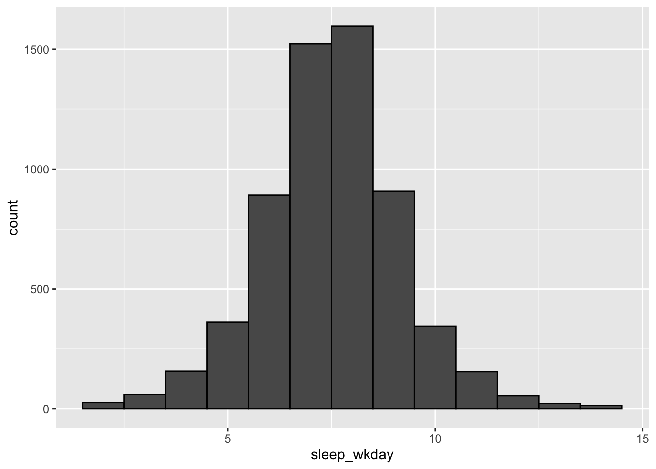
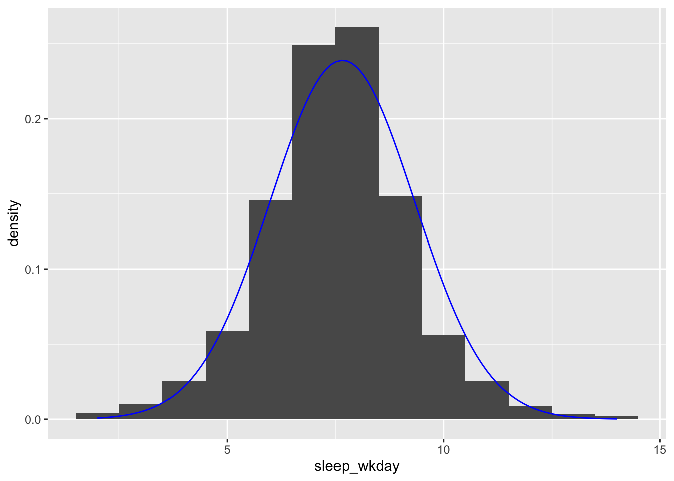
Overlay a normal distribution
ggplot2::geom_function() can overlay a parametric distribution, like a normal distribution, on your histogram. This can be particularly useful for checking normality assumptions.
Be sure to map ..density.. to the y axis in geom_histogram() to keep the layers commensurate:
ggplot(sleep, mapping = aes(x = sleep_wkday)) +
  geom_histogram(mapping = aes(y = ..density..), binwidth = 1) +
  geom_function(
    fun = dnorm,
    args = list(
      mean = mean(sleep$sleep_wkday, na.rm = TRUE),
      sd = sd(sleep$sleep_wkday, na.rm = TRUE)
    ),
    color = "blue"
  )
Histograms in SAS
ggplot() with geom_histogram() is the equivalent of SAS’s SGPLOT procedure with the HISTOGRAM statement:
In SAS:
PROC SGPLOT DATA = data_plot;
  HISTOGRAM col_A / SCALE = COUNT;
RUN;
In R:
ggplot(data_plot, mapping = aes(col_A)) +
  geom_bar()