ggplot(data, mapping = aes(x = col_A, y = col_B)) +
geom_point(mapping = aes(color = col_C))Visualize data with a scatterplot
You want to create a scatterplot to visualize the relationship between two continuous variables in your data frame.
Step 1 - Pass your data to ggplot2::ggplot(). ggplot() creates a blank canvas for your plot.
Step 2 - Set the \(x\) and \(y\) variables with mapping = aes(x = , y = ). ggplot() will use these variables to create a coordinate system.
Step 3 - Add a layer of points with ggplot2::geom_point(). ggplot() will draw a point for each row in your data frame.
Step 4 (Optional) - Use mapping = aes() to add additional variables. Consider mapping these variables to the color, shape, size, or alpha (transparency) of your points.
Be sure to place a + at the end of each line to connect ggplot2 plot elements.
Example
uber contains hourly summaries of Uber rideshare services in regions of Boston, Massachusetts.
uber# A tibble: 864 × 5
source_location provider_service hour price_mean distance_mean
<chr> <chr> <int> <dbl> <dbl>
1 Back Bay UberPool 0 9.38 2.65
2 Back Bay UberX 0 10.9 2.53
3 Back Bay WAV 0 10.6 2.48
4 Beacon Hill UberPool 0 8.47 2.03
5 Beacon Hill UberX 0 10.3 2.16
6 Beacon Hill WAV 0 9.53 2.00
7 Boston University UberPool 0 8.85 2.92
8 Boston University UberX 0 10.2 2.71
9 Boston University WAV 0 12 3.35
10 Fenway UberPool 0 9.95 2.81
# ℹ 854 more rowsWe know that the price of a ride depends on its distance, but we also suspect that different services charge different rates. To explore this three-way relationship, we first make a scatterplot of price vs. distance. We then color the points by provider service.
library(ggplot2)
ggplot(uber, mapping = aes(x = distance_mean, y = price_mean)) +
  geom_point(mapping = aes(color = provider_service))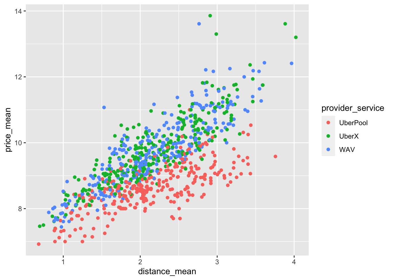
Add a trend line
Use geom_smooth() to overlay a trend line atop of a scatterplot, e.g.
ggplot(data, mapping = aes(x = col_A, y = col_B)) +
  geom_point() +
  geom_smooth()
Scatterplots in SAS
ggplot() with geom_point() is the equivalent of SAS’s SGPLOT procedure with the SCATTER statement:
In SAS:
PROC SGPLOT DATA = data_plot;
  SCATTER X = col_1 Y = col_2;
RUN;
In R:
ggplot(data_plot, mapping = aes(x = col_1, y = col_2)) +
  geom_point()